LUMI SKIN LAB creates premium skincare for sensitive, stressed skin in urban environments.
The client approached us with the task of designing and implementing a DTC online store as the brand's primary digital sales channel, with an emphasis on convenience, aesthetics, and long-term growth.
RESULT
+38%
Growth in online sales after launching a new website and optimizing the user journey.
$40
Average purchase value on the website after improving the catalog structure, product cards, and checkout process.
3.4x
Increased conversion efficiency thanks to a well-thought-out e-commerce architecture and visual presentation of products.
01
Product presentation & content
Creation of visual and text content exclusively for use within the website.
02
Website strategy & architecture
Designing the structure of an online store, page logic, and user scenarios — from the first touch to placing an order.
03
UX/UI design
Development of an online store interface with a focus on usability, visual balance, and premium brand perception.
04
Ecommerce development
Complete technical implementation of an online store with a focus on stability, speed, and scalability.
05
Conversion optimization
Optimization of the user journey and key decision points.
06
Analytics
We connected analytics and made decisions based on data and reports.
01
Product presentation & content
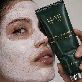
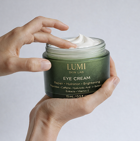
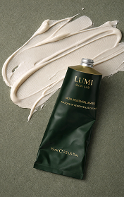
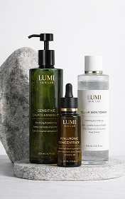
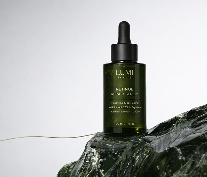
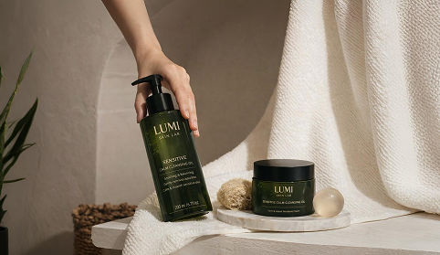
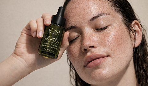
We prepared a package of visual content as an additional service—exclusively for the design of the online store. Images and short clips were used in product cards, collections, banners, and key blocks of the site to reinforce the perception of a premium brand and improve the quality of product presentation.
Why did the client choose AI over traditional photography?
Production result
We approached production not formally, but as a key brand asset: we immersed ourselves deeply in the LUMI style, compiled a visual code, and brought each frame to a premium level so that the content would immediately work for the website — without any “rawness” or compromises.
In addition, we structured the process so that content could be quickly scaled to new products and sets, while maintaining the same “expensive” visual language of the brand.
270+
60+
55
4
8

Pre-production
Concept and visual code
We determined exactly how LUMI should “sound” in videos: warm premium, calm tempo, tactile textures, soft lighting, and clean composition, so that the videos would look like part of a single brand—on the website.
Short list for sale
We compiled scenarios for videos focusing on product selection and use: showing packaging and textures, providing clear instructions on “what, when, and how to use,” emphasizing sets as ready-made solutions, and versions for advertising offers—so that the videos would not embellish, but rather help viewers make decisions and purchases.
AI shooting
Creative production and quality control
We worked as if we were on set: we maintained the composition, perspective, materials, and “expensive purity” of the image so that it would not appear “generated.”
Unified visual language of the brand
We compiled content so that all frames had the same lighting, textures, and tone, ensuring that the brand was perceived as a whole on the website.

Post-production
Final refinement
We standardized the color, lighting, and packaging details to ensure consistent, premium visuals across all channels.
Adaptation to formats
We prepared versions for key sizes (1:1, 4:5, 9:16, 16:9) so that the content looks “native” in every placement.
Video production
Premium-style brand video
In addition to photos, we put together a video production in the same premium style: short, tactile clips with clean composition, soft lighting, and an emphasis on the packaging material and the feeling of a “care ritual.” Without loud effects, with an emphasis on calmness, trust, and brand quality.
We prepared separate videos for banners on the website: hero videos and short loop animations that reinforce the first impression, hold attention, and help users quickly understand the product and sets. All materials were adapted to key formats and placement scenarios so that the videos would look organic and “expensive” in each block of the website.
02
Website strategy & architecture
We created a DTC store from scratch and equipped it not only with design and a showcase, but also with a full-fledged sales system. The website was supposed to become the brand's main channel and act as a care consultant — explaining, helping to choose, and gently guiding customers to the right set, while maintaining a premium tone and trust.
Our approach is based on a combination of branding and performance: we designed the website not to look pretty, but to convert visitors into buyers, retain their attention, build a customer base, and encourage repeat purchases.

Product cards as mini landing pages
Each product is designed to sell and explain: benefits, who it is suitable for, how to use it, active ingredients, answers to frequently asked questions, as well as tips on “what to add to this” for routines and sets. We made the cards so that people could make a decision without consulting a sales representative.
Technical details
We set up the basic e-commerce infrastructure: payment methods, delivery, promo codes, notifications, legal pages. We made the checkout process as short and straightforward as possible to avoid losing purchases at the final step.
Adaptive, speed, and quality
We tested all key scenarios on mobile devices and optimized pages and visuals to ensure that the website did not slow down or ruin the premium experience. In the premium segment, the speed and accuracy of the interface directly affect trust.

Strategy and alignment
We approached this stage as “laying the groundwork” so that we wouldn't have to make endless revisions and argue about taste later on. We started by analyzing the brand's current situation and goal—to move away from dependence on Instagram/marketplaces and build a sustainable DTC channel where the brand controls the presentation, price, and customer relations. Next, we defined the positioning in clear terms: premium care for sensitive urban skin, a warm and supportive tone, without aggressive promises or “miraculous results.”
To ensure that the solution was not abstract, we went through the client's references head-on: what exactly they liked — light, textures, cleanliness, minimalism, premium quality, text presentation; and what was categorically unacceptable — visual noise, medical “dryness,” mass-market clichés, overly “glamorous” promises. Based on this, we compiled a visual code (palette, materials, typography, composition rules) and content code (language, vocabulary, taboo phrases, level of “softness” and expertise) so that both the design and the texts would speak with one voice.
Trust and engagement
We added a review section to the home page to boost trust and address key concerns before purchase right on the first screen of interaction with the brand. The section contains short, specific reviews focusing on the experience and results of using the product, as well as videos from influencers showing the product in real-life use and in their daily routines.
This format gives the effect of a personal recommendation, increases engagement, and helps customers make a purchase decision faster, while maintaining the brand's premium tone and calm presentation.
Product catalog and navigation
We designed the catalog so that people could quickly find the right skincare products without being overwhelmed by too many choices. To achieve this, we created a clear category structure, added convenient filters and sorting options, thought through the search results priorities, and created informative product cards that immediately explain what the product does and who it is suitable for.Additionally, we linked items together using routine logic so that users could see what to add to their skincare routine and more easily move on to purchasing a set, while the interface remained clean and fast on mobile devices.

03
UX/UI design
We developed the online store interface as an extension of the brand's philosophy—calm, tactile, and intuitive.The main task was to create a sense of confidence and care from the very first seconds of interaction, without visually overwhelming the user or imposing solutions.
Concept developed
We relied on the brand strategy and, together with the client's team, established a unified visual code, communication tone, and presentation rules to ensure that the feed looked consistent and premium across all platforms. The concept is based on calm confidence, care without pressure, and clear solutions for sensitive urban skin, where the content does not promise miracles but helps you choose and apply the right skincare products.
“In harmony with your skin and yourself”

We built content around real audience requests so that people could recognize themselves and immediately understand that the brand could solve their problems. The website regularly features series on skin conditions and city triggers, analyses of habits that increase sensitivity, and clear morning and evening skincare routines so that users see not just individual products, but a whole system.
The second part of the content supports trust and choice through product formats, which explain the functions, textures, combinations, and order of application, as well as show the product in real use. Separately, we incorporated trust-building and decision-support elements on the website to strengthen confidence and guide users through key product pages and the purchase flow.


Visual language
We enhanced the feeling of premium minimalism through a warm, natural palette.
The color scheme is based on deep green glass, light neutral tones, and soft natural accents that emphasize quality and connection with nature while maintaining the brand's modern urban character.

Stories
Stories were integrated as part of the interface and navigation logic. They work like mini-consultations: they help you understand the problem, explain the cause in simple language, and gently guide you to a solution through the product and routine.
Each scenario is based on real skin conditions — sensitivity, inflammation, dehydration, dullness, and reactivity — and logically continues the user journey within the site.


04
Ecommerce development
We developed the DTC online store as a full-fledged e-commerce system—with a well-thought-out architecture, high speed, and a stable purchasing process on all devices. The main focus was on reliability, scalability, and a seamless user experience.
+95
Mobile version performance indicator after optimizing templates and visual elements.
1.8 seconds
Average loading time for key pages on the site.
+22%
Increase in completed purchases after simplifying the shopping cart and checkout logic.
Catalog architecture
We built the structure of collections, product cards, and navigation so that users can find the right product faster and better understand the differences between items.
Localization and system settings
Currencies, formats, and basic content display logic are configured for stable store operation in different regions and on different devices.
Checkout and integrations
A stable shopping cart and checkout scenario has been implemented with the necessary services connected and protection against errors at the final stage of purchase.
Performance optimization
Templates, images, and scripts have been optimized to reduce load and maintain stable site performance as traffic grows.
What scenarios were implemented on the website
Navigation by skin problems
We built the site structure around real skin conditions — sensitivity, dehydration, inflammation, reactivity.
This allowed users to find suitable solutions faster and go straight to relevant product selections.
Product navigation
For users with a specific request, we implemented a search and selection logic based on product type, format, and purpose, with a clear transition to the next step within the site.
Brand structure and selection logic protection
We built a separate logic for brand pages and key entry points so that users always end up in the correct scenario and don't get lost between products and categories.
Return to selection
For users who have already interacted with the site, we implemented a logic for returning to previously viewed products, sets, and selection stages — without pressure or aggressive mechanics.
Catalog and product showcase
We have configured the structure of the catalog and product cards so that the visual presentation, grouping, and display logic reinforce the understanding of the product's value and facilitate decision-making.
05
Conversion optimization
We optimized the user journey within the site—from the first screen to checkout—to reduce hesitation, simplify selection, and increase conversion without pressure or aggressive tactics.
The focus was not on “sales techniques” but on logic, clarity, and trust—key factors for a premium DTC brand.
User decision framework
Clear product logic
A clear structure for the catalog and product cards helps users quickly understand the differences and purposes of each product.
Guided decision flow
Smoothly guides users through the site with tips, recommendations, and selection scenarios.
Trust-driven experience
Builds trust through visual consistency, text, and a consistent sense of quality.

Simplified choice
Reduced cognitive load through set logic and product grouping.
Stronger product understanding
Focus on explaining product value rather than features.
Reduced friction points
Optimization of key steps before purchase and simplification of interaction.
Consistent purchase flow
A unified behavior scenario on all pages of the site — from the catalog to checkout.
RESULT
+32%
Conversion growth after optimizing the user journey and website structure.
-27%
Reduction in bounce rates on key pages by improving navigation logic and product presentation.
+21%
Increase in the number of completed purchases by simplifying the selection scenario and checkout process.

Charged for change?
For clients:
contact@nexxdigitalagency.com
- Choosing a selection results in a full page refresh.